Skip to main website content

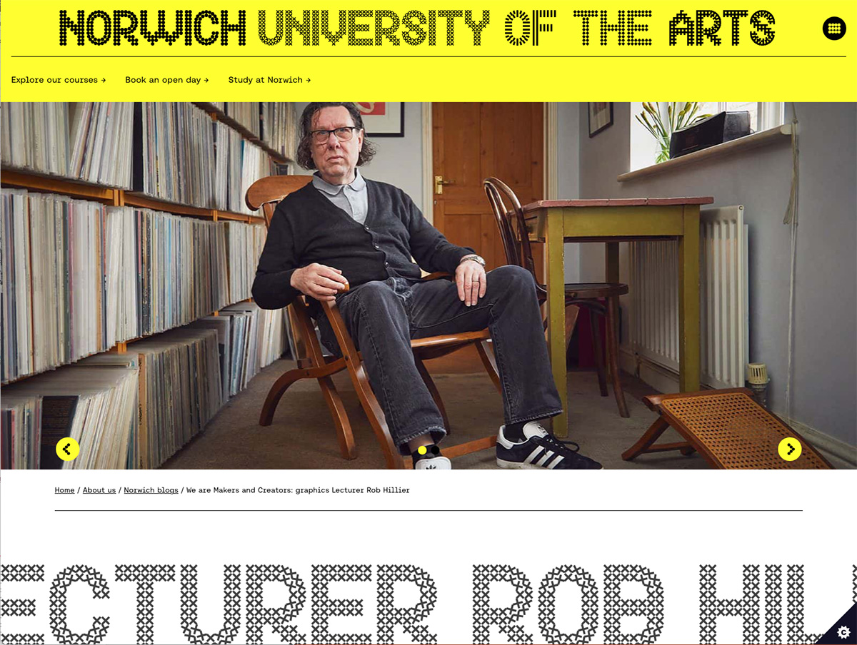
We are makers and creators: graphics lecturer Rob Hillier, Norwich University of the Arts website, June 2021. View webpage.

Screengrab of the webpage. Shows a bright yellow header with the words 'Norwich University of the Arts' above a photograph of Robert with large text below reading 'Lecturer Rob Hillier' and scrolling across the bottom of the page
 

The illustrated guide to dyslexia and it’s amazing people, Kate Power and Kathy Iwanczak Forsyth, 2017. Jessica Kingsley Publishers. U.K. View PDF.

Screengrab of the webpage. Shows the title in large purple letters at the top, with the article body text below, and a photo of Robert below that
 

Exploring typography, second edition, Tova Rabinowitz Deer, 2015. Cengage. U.S.A. View PDF.

Image of the cover, shows a red to orange gradient background, then a large blue lowercase ‘g’ letter, with ‘Exploring Typography’ in capital letters
 

Hiut typographic magazine, 2013. South Korea. View PDF.

Image of the front cover, shows a light yellow background with a Chinese man in an oval shape in greyscale, then Chinese writing on the right
 

Norwich, UNESCO city of literature book, 2012. National Centre for Writing, Norwich. U.K. View PDF.

Image of the front cover, background is an apricot colour with ‘Norwich’ written in black handwriting
 

A font of knowledge, Eastern Daily Press, article, 24 July 2008. View PDF.

Photo of the newspaper article, shows 4 columns of text, the title ‘A font of knowledge’ at the top, then a large photo of Robert sitting on a desk with a blackboard behind, with chalk marks showing the word shape issue in typography
 

Font makes all the difference, Eastern Daily Press, reader comment, July 2008. View PDF.

The newspaper cutting, has a yellow background, then the article in 1 column which says: Font makes all the difference. BRENDA WESTON, Medeswell, Orton Malborne, Peterborough. We have a caravan at East Runton and when there we read the EDP. I was very interested in the article in EDP2 headline “A font of knowledge” regarding a typeface especially for dyslexic people. My husband is 66, severely dyslexic all his life. Two years ago he started attending special classes which helped him. When I showed him the special typeface/font, Immediately he could see and read it more easily. I hope I can obtain the font on my PC to type my husband’s homework
 

The Sylexiad: typography for dyslexics, étapes, July 2008. View PDF.

Image of a double page spread from the magazine, shows various typographic experiments with letters
 

Focus on research degrees at NSAD, Norwich School of Art and Design (now known as Norwich University of the Arts) alumni magazine, Summer 2008. View PDF.

Image of a spread from the magazine, shows a dark grey background, with 2 columns of text, then in the top right a greyscale photo of a building
 

What do dyslexics read?, Novum, April 2008. View PDF.

Image of a double page spread from the magazine, shows various typographic experiments with letters
 

Sylexiad: a typeface for adult dyslexic readers, Ultrabold, Spring 2007, issue number 2. The Journal of St Bride Library. View PDF.

Image of a double page spread from the magazine, shows various typographic experiments with letters
 

Sylexiad: a typeface for the adult dyslexic reader, Norwich School of Art and Design (now known as Norwich University of the Arts) newsletter, June 2007. View PDF.

Image of a page from the magazine, shows various typographic experiments with letters, then the title ‘Sylexiad: a typeface for the adult dyslexic reader’ in dark red in the middle